We’re so excited to share with you what we’ve been working on for several months now. Today, we’ve started rolling out a fresh, redesigned Fleep across all platforms: Fleep 2.0, the slickest version of Fleep yet.
But this isn’t a “Yay, we did it! High fives all around!” post (although our team definitely deserves some beers high fives at this point). This also isn’t just about “What’s new?” – we’ll let the user interface and Product Hunt do the talking for that. This post sheds light on the designer’s viewpoint. Who is this wizard who made all this magic happen?
 Meet Stefan.
Stefan Hiienurm isn’t your average designer. He is the Lead Product Designer and Co-Founder of Thorgate (here’s some of Stefan’s work on Dribbble). He was also the Lead Designer for Fleep 2.0.
Stefan doesn’t just do good design, he works through every step to a great user experience – from concepts to execution. And believe us when we say he is ruthless in demanding excellence (in the best way possible).
We could go on, but let’s hear it from the man himself! Here goes:
Q: Why did you accept the challenge of improving the Fleep brand and design?
I love challenges. Everything that is out of my comfort zone is something that I would like to do.
Q: How is the new Fleep 2.0 brand making things better? And more importantly, why?
The goal while designing the new brand was to make it more friendly. Fleep is a communication app, and when people communicate with each other, they want to feel the same emotions as in real life. So, we changed the primary brand colour from the so-called hospital green to a warm blue. We also added more secondary colors so Fleep is no longer monochromatic.
Additionally, there were many small changes and tweaks we made during the redesign process to ensure the best possible user experience, one that delivers emotions to people using Fleep.
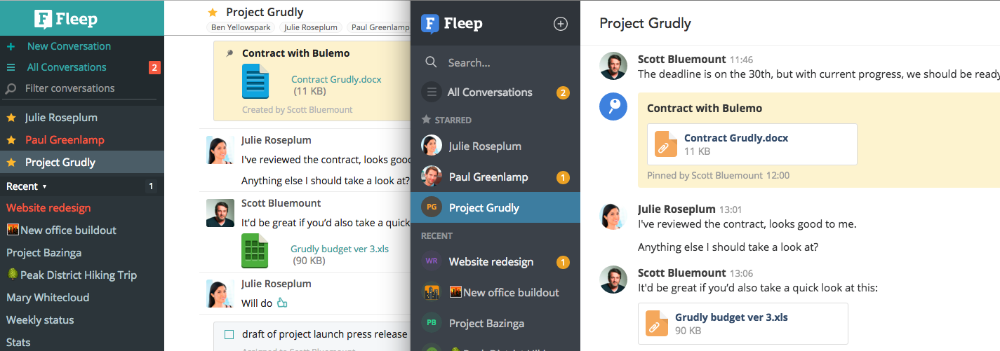
Fleep vs Fleep 2.0
Q: What were the first steps you took in the process of the redesign?
The first step was to get know the product. There were hundreds of corner cases that I needed to know before I could even start with any design work.
After getting acquainted with Fleep, I started to lay down the main User Interface (UI) Framework, which is a fundamental part of the UI design. Defining core elements and styles at the outset, and sticking to them, helped to keep the design principles consistent across all the platforms throughout the redesign process.
Q: Who were the key people behind the rebranding?
I would say everybody on the Fleep Team. Designers only give visual input and bring the idea together – but in general, everybody involved gives their ideas for the new updated brand.
Thanks for working with us, Stefan – and thank you for sharing your thoughts on the redesign process.
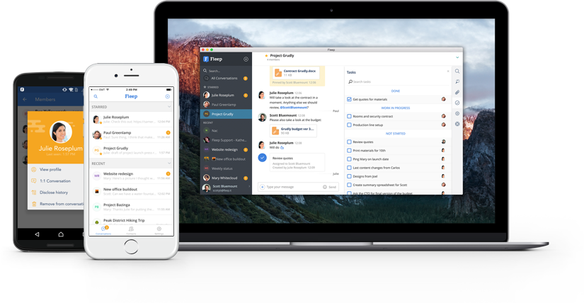
That’s it. You’re now ready for the fresh Fleep 2.0 experience. Check Fleep 2.0 out on web, Android, and iOS today. We hope you love it. You can also read more about the redesign from our Product Owner and CEO Henn in this blog post.
Let us know what you think on Twitter, Facebook or directly to Fleep Support (support@fleep.io)!