For a while now, we’ve been iterating on some nuances of the right pane in Fleep. This has meant lots of revisions of its width, how it relates to the rest of the conversation and also to all the tabs on the right pane inside conversations in Fleep.
Expand and collapse the right pane in Fleep
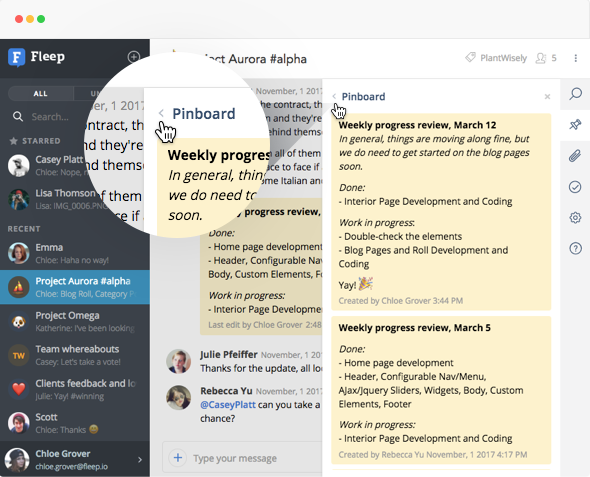
Let’s start with the basics — in case you didn’t know, you can use the little arrow icon on the right pane tabs to expand and collapse the right pane. This is not new in itself, but what has changed recently are the sizes of the right pane when it’s opened.

The wide right pane just got even wider
The smaller, default size of the right pane is now half of the size of the message flow. Also, the right pane now opens on top of the message flow in most cases — we support using the message flow and right pane actively side by side only when the Fleep window is wider than 1746px. Opening it on top of the message flow prevents the message flow from jumping around and some other not-so-nice user experiences.
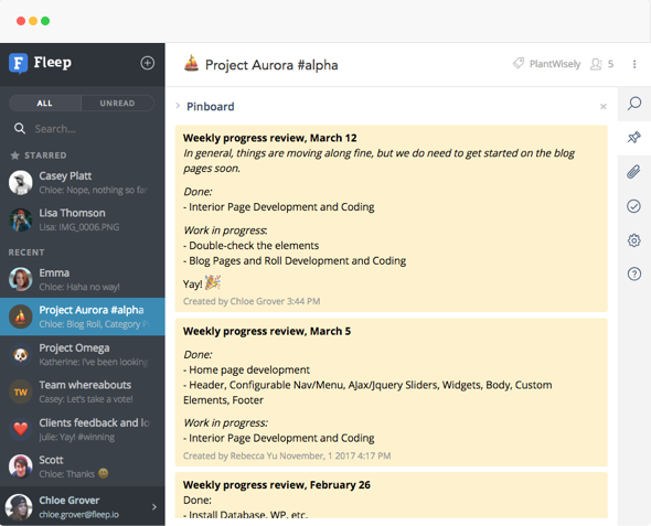
The change we’ve made to the size of the expanded, wide right pane, is much more significant though. Now, if you expand the right pane, it enlarges to the width of the message flow, covering it entirely.

Read and write messages on the wide Pinboard
The Pinboard is a good place for any kinds of important messages, from meeting notes to product specs. Reading or browsing through long pinned messages just got more pleasant with the wide right pane. The text has more space, and you are not distracted by what’s going on in the message dlow.
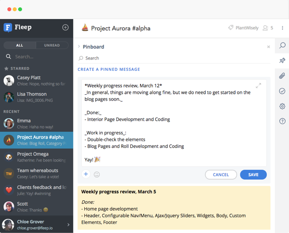
The wide right pane also makes writing longer pinned messages truly enjoyable. No more distractions from the message flow! More space for your own thoughts! See for yourself:

Zen task management with the wide Taskboard
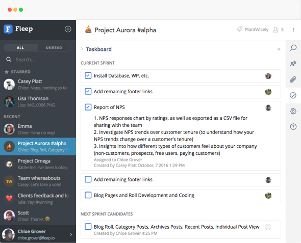
In our own team, we use Fleep Tasks daily. And the Tasks can sometimes get quite long… That is, if the product manages to do a thorough, good job writing up product specs, bug reports, and other to-do items in the form of Tasks.
The new wide Taskboard is excellent for managing your Fleep Tasks. Why? First of all, you do not get distracted by what’s going on in the message flow in the background, because the Taskboard covers it entirely. Secondly, you can read the longer Task messages much more comfortably, as they can take up more space, and thus fit much more space on the screen. And, if you’re the one writing up the tasks, doing that in the wide Taskboard is just really zen.

We hope you enjoy using the wide right pane in Fleep! All feedback and requests are welcome via support@fleep.io. Follow us on social media to be the first to hear about our product updates! We’re on Twitter, Facebook, LinkedIn and Instagram.

